Awards
Pin Up Design Awards 2013
Silver
The Process
Wireframes
Initial concept

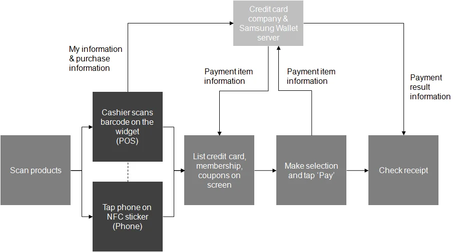
Rough data flow
2nd iteration
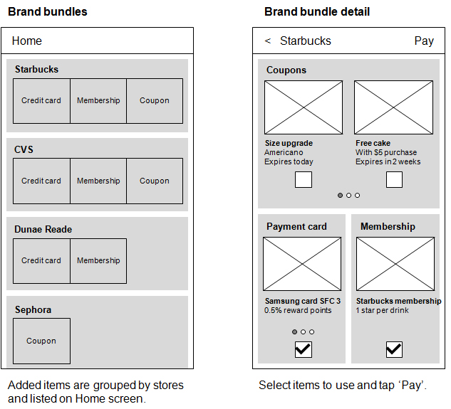
The concept of a single-scan ID and instant grouping of items could not be implemented due to the lack of infrastructure and tight development schedule. So we came up with an alternative solution where new items would be automatically grouped by stores and listed on Home screen for easy access.
Result
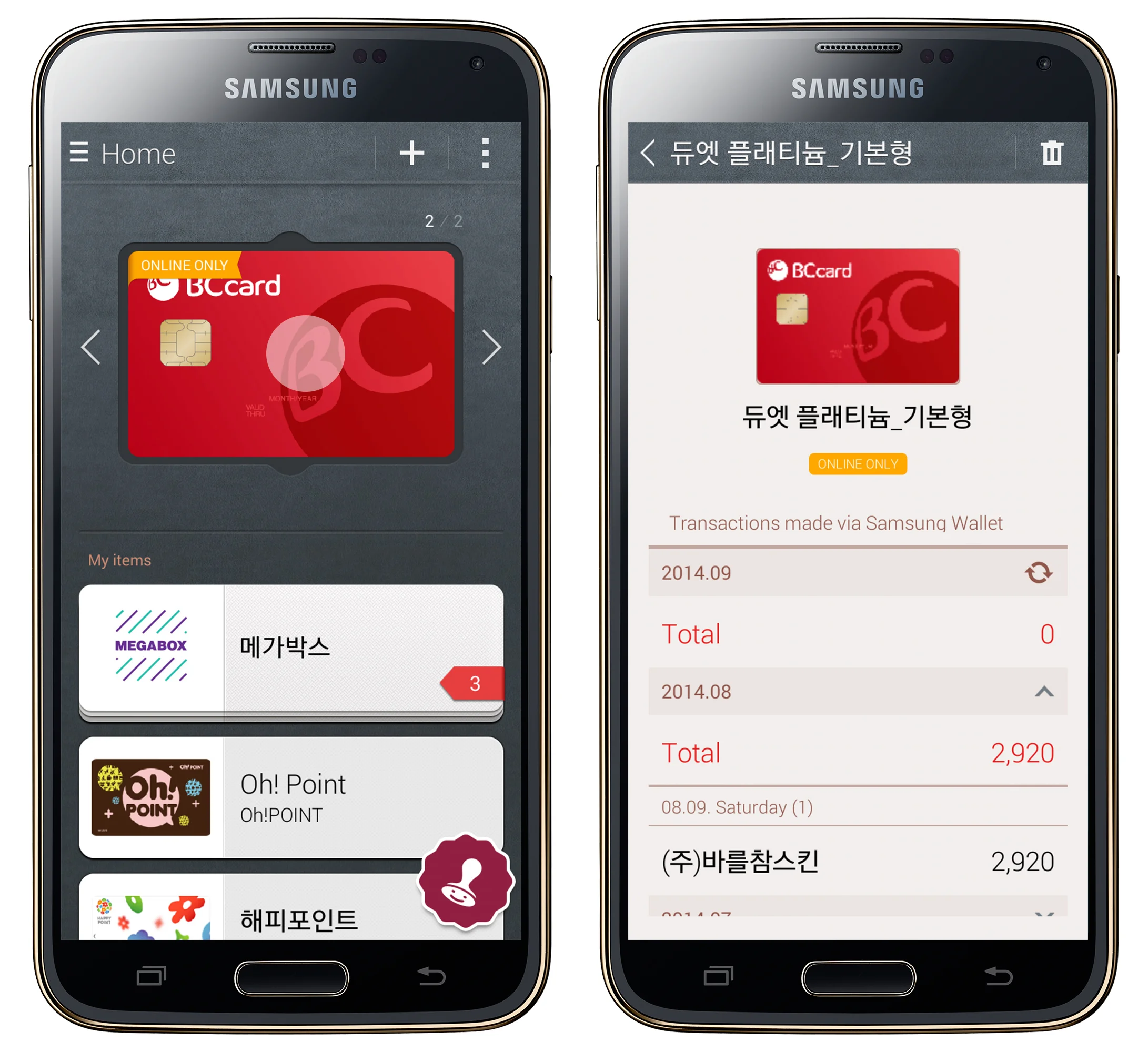
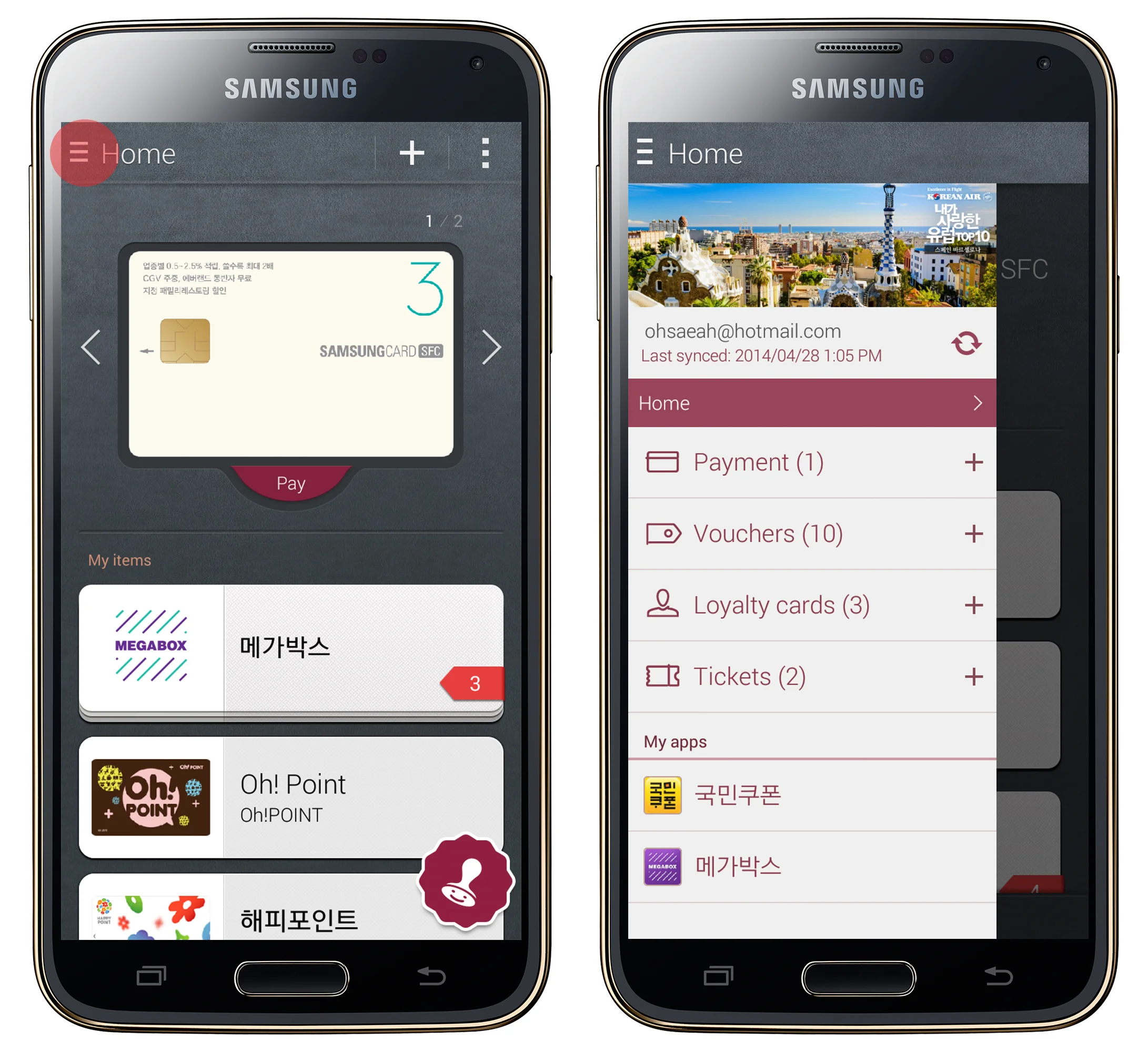
Home
Payment cards are displayed separately at the top because they're applicable at all stores. Membership cards, coupons and tickets are grouped into Brand Bundles so that users can access all the items they need at the store in one place.

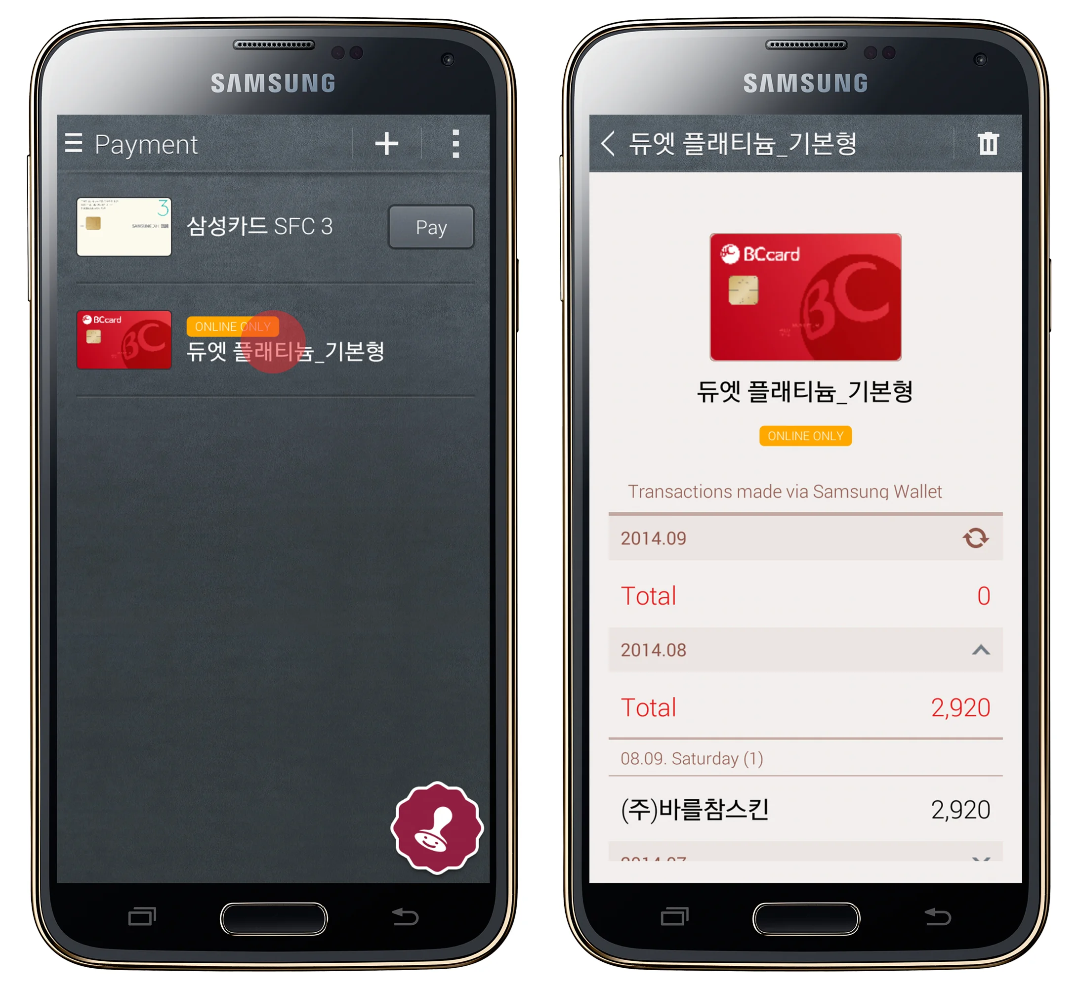
Home - Payment detail
Tap the payment card on Home screen to make a payment or view payment history.
Home - Brand bundle detail
Tap a brand bundle in the Home screen to view a list of items in the brand bundle. Tap an item to view the detail page. Swipe left and right to view the rest of the items in the brand bundle.
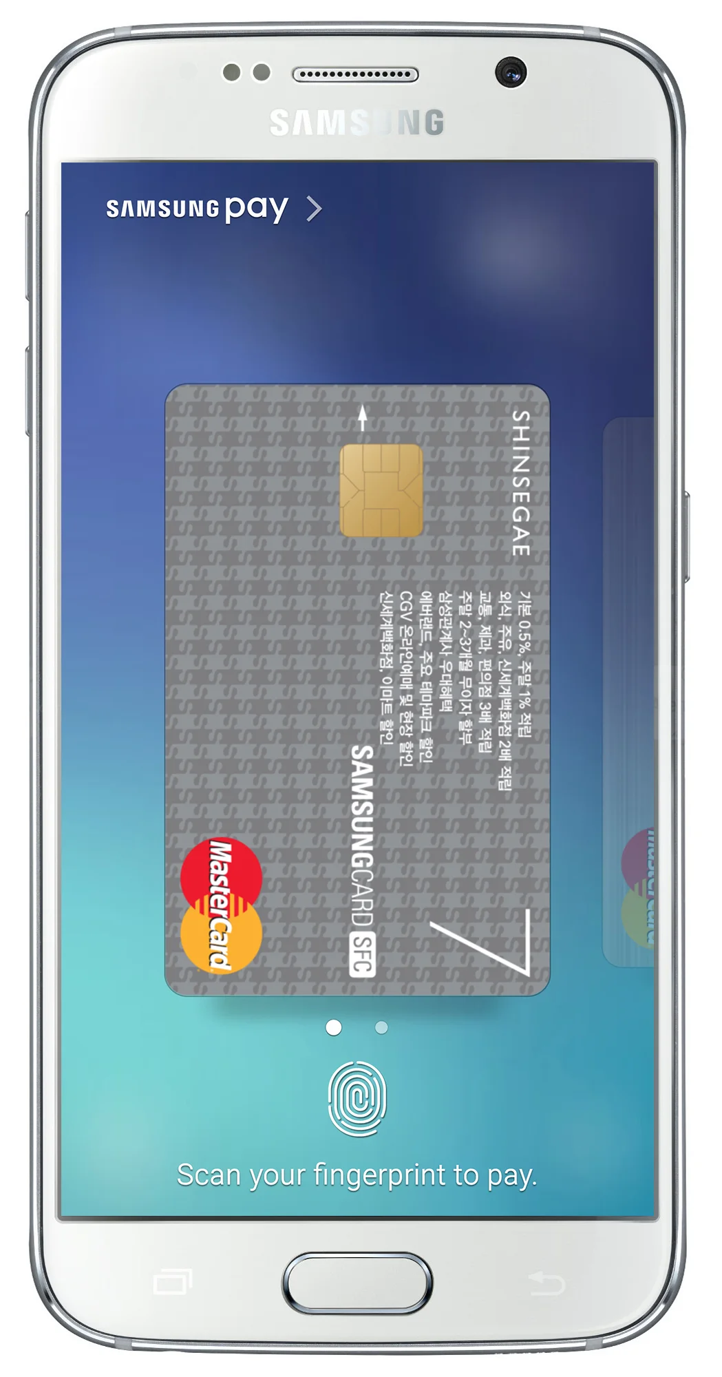
In-store payment flow
Tap a payment card and enter the PIN code. Pay by scanning the barcode/QR code or tapping the phone on an NFC reader.

Online payment flow
Click 'Pay with Samsung Wallet' on a merchant site. A notification pop up will appear on the phone. Select payment options, enter the PIN code and tap 'Pay'. Confirmation will be provided on the merchant site.

Drawer
The drawer houses the full menu.
Payment page
View all payment cards and payment history.
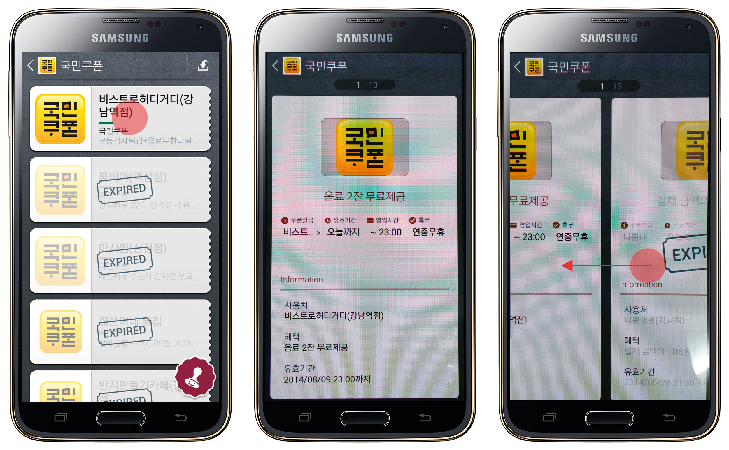
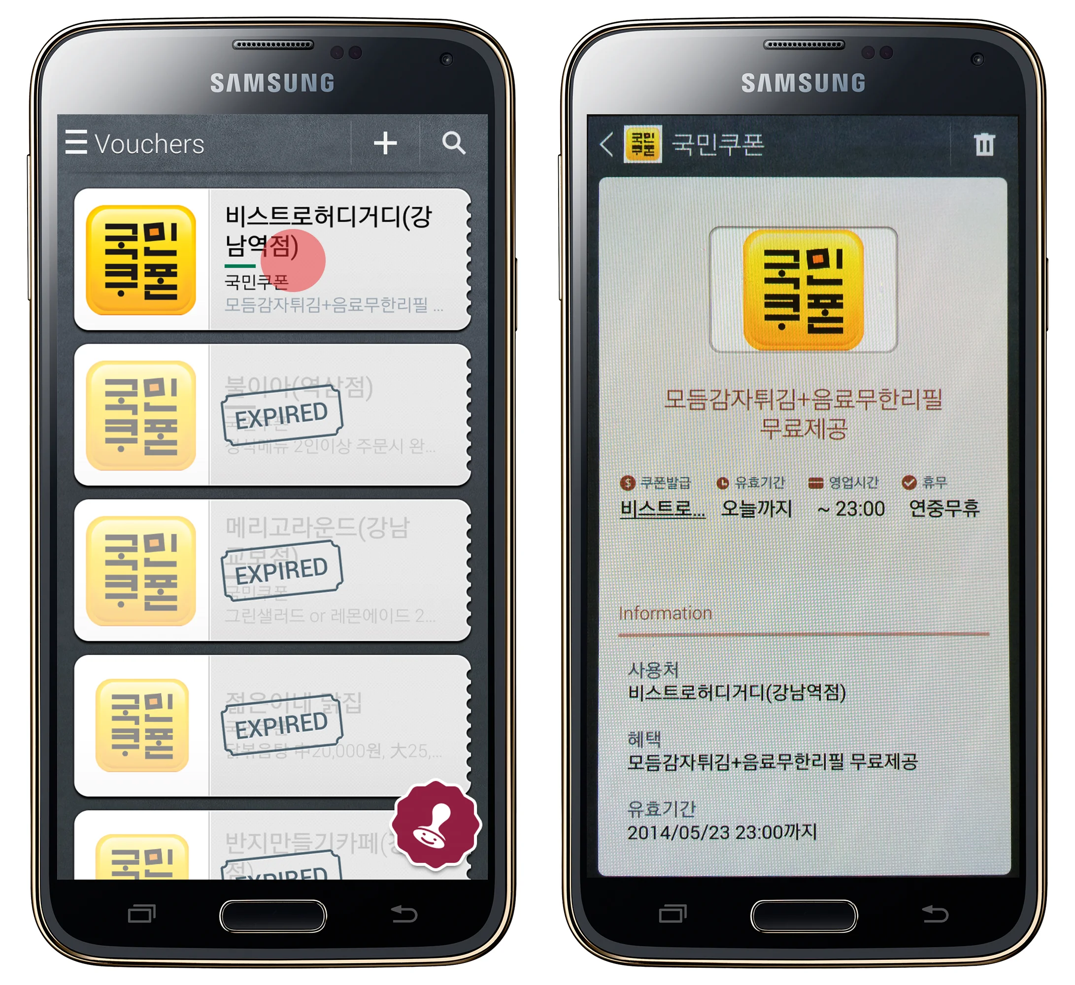
Coupons page
View all coupons and detail pages. Present the information on the detail page or the barcode (if available) to the staff to redeem the coupon.
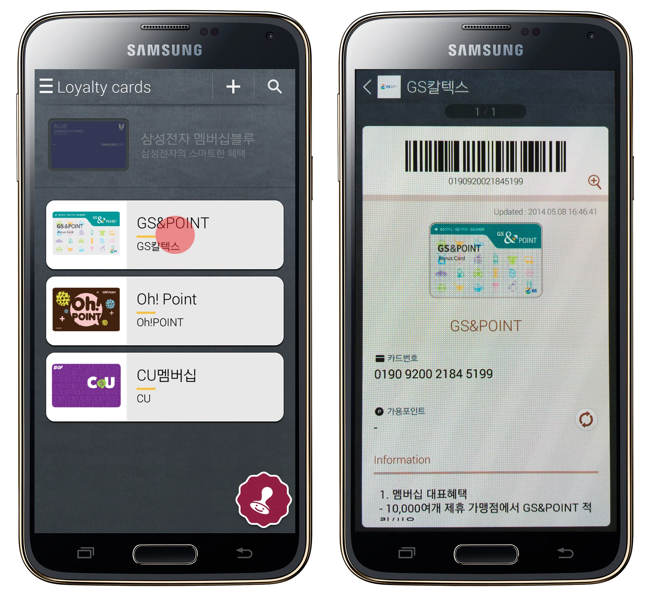
Membership cards page
View all membership cards and detail pages. Present the barcode to the staff to use the loyalty card.
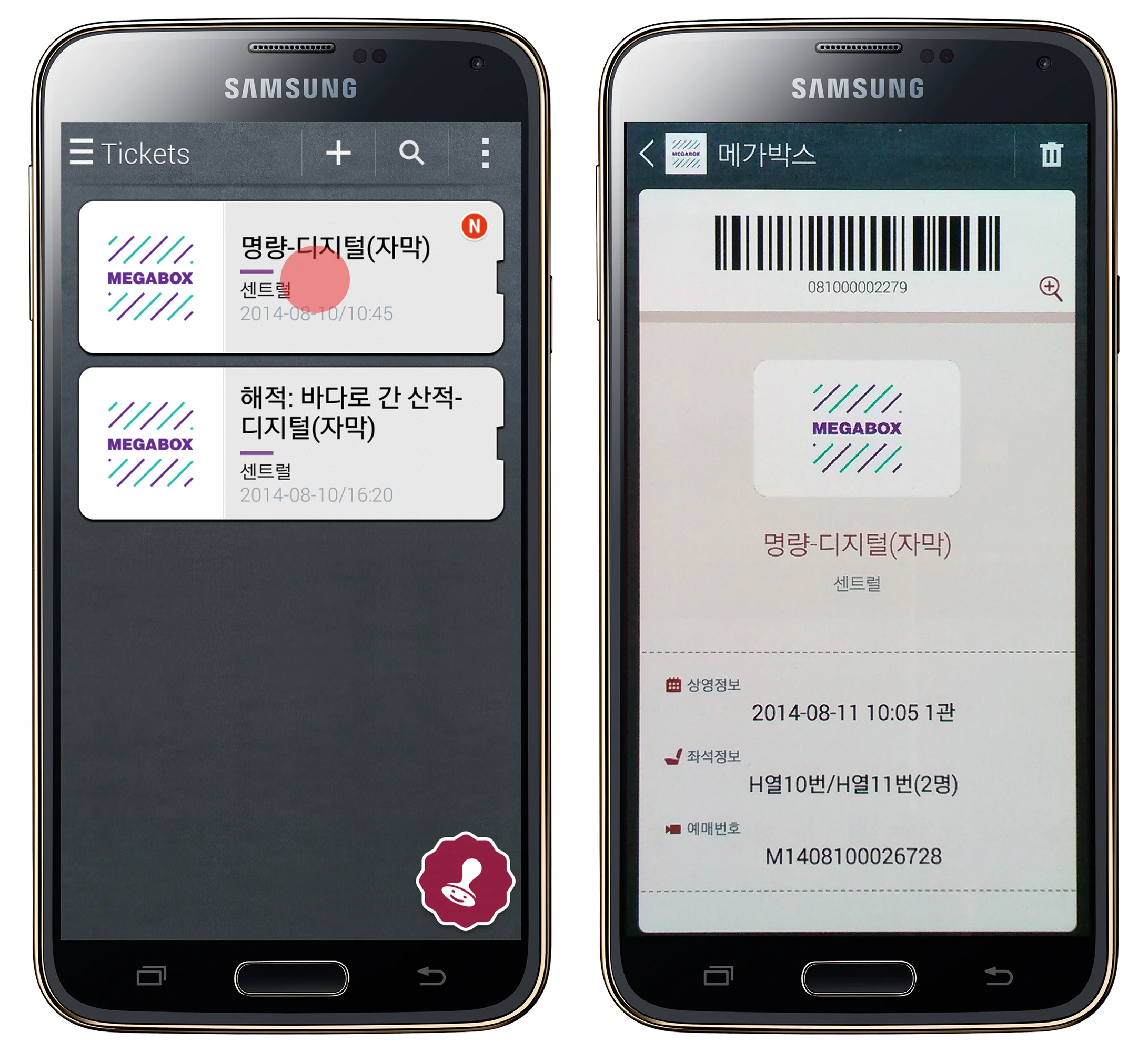
Tickets page
View all tickets and detail pages. Present the barcode to the staff to use the ticket.
App updates after the launch
Challenge
After the launch, we still had to face constraints due to varying policies coming from multiple partners. The design had to adapt to these intermittent changes.
Solution
The goal of the UX team was to provide holistic solutions to segmented requirements from various partners. For instance, it turned out that some of the credit card companies provided online payment only and some others provided both online and offline payment. Having these online payment cards in the 'Brand Bundles' would conflict with the usability. After careful consideration, we decided to pull the cards out of 'Brand Bundles' and created a dedicated section in the hero space of Home screen. As a result, these payment cards became the face of the app and first-time users found it easier to recognize the key functionality of the app.
My Role
I worked in close communication with the Planning and Development team to respond to the constant change in requirements and to provide UX solutions that remained within the initial key concept. I also took part increating a roadmap and setting the objectives for each app update.